Phased rollout of new marks and logos is planned
Vanderbilt University today launched a refreshed visual identity designed to reflect the university’s forward momentum and to build pride and visibility across the institution, including its athletics program. The new identity, which includes a clear articulation of who the university is today through new wordmarks and logos, has been approved by the Vanderbilt University Board of Trust and will be implemented in phases, starting in late March.

“All great institutions have a clear sense of themselves. As we prepare to celebrate our 150th anniversary next year, it’s time for Vanderbilt to sharpen our expression of who we are and what makes us unique. As we look ahead, we believe that a strong sense of self will direct and accelerate our growth and evolution,” Chancellor Daniel Diermeier said. “This new visual identity is designed to help build and share the pride in our collaborative community and to bring greater visibility to our university across the country and around the world.”
Updates to the Vanderbilt identity come after extensive input from across the community, with more than 500 completed surveys, 70-plus one-on-one interviews and dozens of workshops and group engagement sessions conducted during the past two years. Steve Ertel, vice chancellor for communications and marketing, led the effort.

“Our ‘One Vanderbilt’ spirit defines who we are, and we wanted our identity to reflect that,” Ertel said. “We heard from individuals across the university that they wanted our marks to signify who we are today, and that they also wanted to demonstrate stronger unity between the university and athletics. The symbols we use to express who we are as a community help us convey a shared sense of purpose that can guide and inspire us while also attracting others to join and support that shared purpose.”
Candice Lee, vice chancellor for athletics and university affairs and athletic director, was a key partner in the effort.
“From my perspective, the timing is perfect in that it illustrates the ‘new era’ that we have spoken of often,” Lee said. “It’s a new day, with new energy, alignment and momentum to match. It’s another example of ‘Vandy United’ in action.”
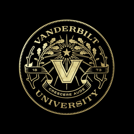
The refresh also includes a completely redesigned university seal. The seal features a new Latin motto, the university’s first: “Crescere aude,” which translates to “dare to grow.”

The seal’s components include a strong V mark that will serve as a connecting symbol across the university; Vanderbilt’s founding year; oak branches, which are part of the Vanderbilt family crest; and references to navigation, including a star and compass elements signifying charting a forward course together. The same V mark has been incorporated into an updated primary logo for athletics.
The university’s visual marks are now characterized by a serif-based font that was created specifically for Vanderbilt. A new color palette for all media is also part of the new identity system.
The university worked with renowned design studio Upstatement on the identity refresh, building upon a previous collaboration with them to relaunch the university’s new website in 2021. Upstatement is considered an industry leader in creative and digital product design. They have extensive experience working with top-ranked schools, including MIT, Harvard, Princeton and Yale, as well as major sports media companies, from ESPN to the PGA Tour, to inspire audiences in their respective fields.
The university last updated its primary wordmarks and logos in 2003.
View the full visual identity on the Guidelines website, and access resources, including new email signatures and PowerPoint templates. VUnetID and password are required.