
When the first cases of COVID-19 were diagnosed in Tennessee, Natalie Robbins, a staff researcher with the Vanderbilt Initiative for Interdisciplinary Geospatial Research (VIIGR), was curious to see where the cases were across the state—and how they would spread.
“I was able to find maps that told you how many cases there were per state, such as Johns Hopkins’ global coronavirus map, but there was nothing out there showing county-level data,” said Robbins, who develops informatics techniques to analyze spatial data and environmental phenomena. “I knew it would be helpful for Tennesseans to be able to see where the cases were relative to where they lived, so after a few days, I decided I would just build that map myself.”
The Tennessee COVID-19 map that Robbins developed not only shows where the positive cases are across the state—drawn from the Tennessee Department of Health—but also provides the latest information on negative test results, as well as test results for non-Tennessee residents diagnosed here. The map also provides metrics for each county that policymakers may find relevant to their public health efforts, including families with children, percent elderly, percent eligible for federal nutrition assistance, percent uninsured, percent insured by Medicare and more.
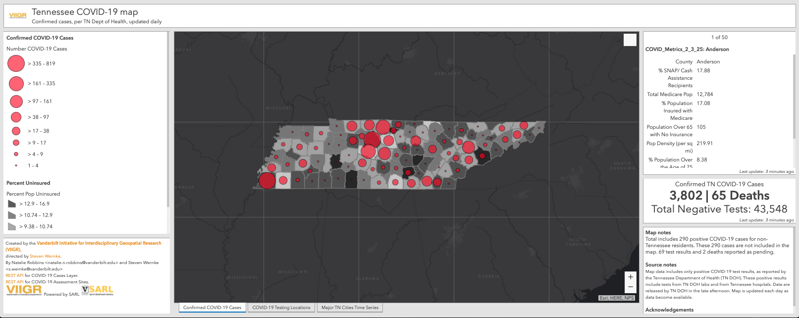
Steven Wernke, Joe B. Wyatt Distinguished University Professor, associate professor of anthropology and director of VIIGR and Vanderbilt’s Spatial Analysis Research Laboratory (SARL) collaborated with Robbins on the map’s development. “Our hope here is that not only will the public be able to refer to this to stay informed, but that policymakers will use this information to identify areas of the state that may need extra support,” he said.
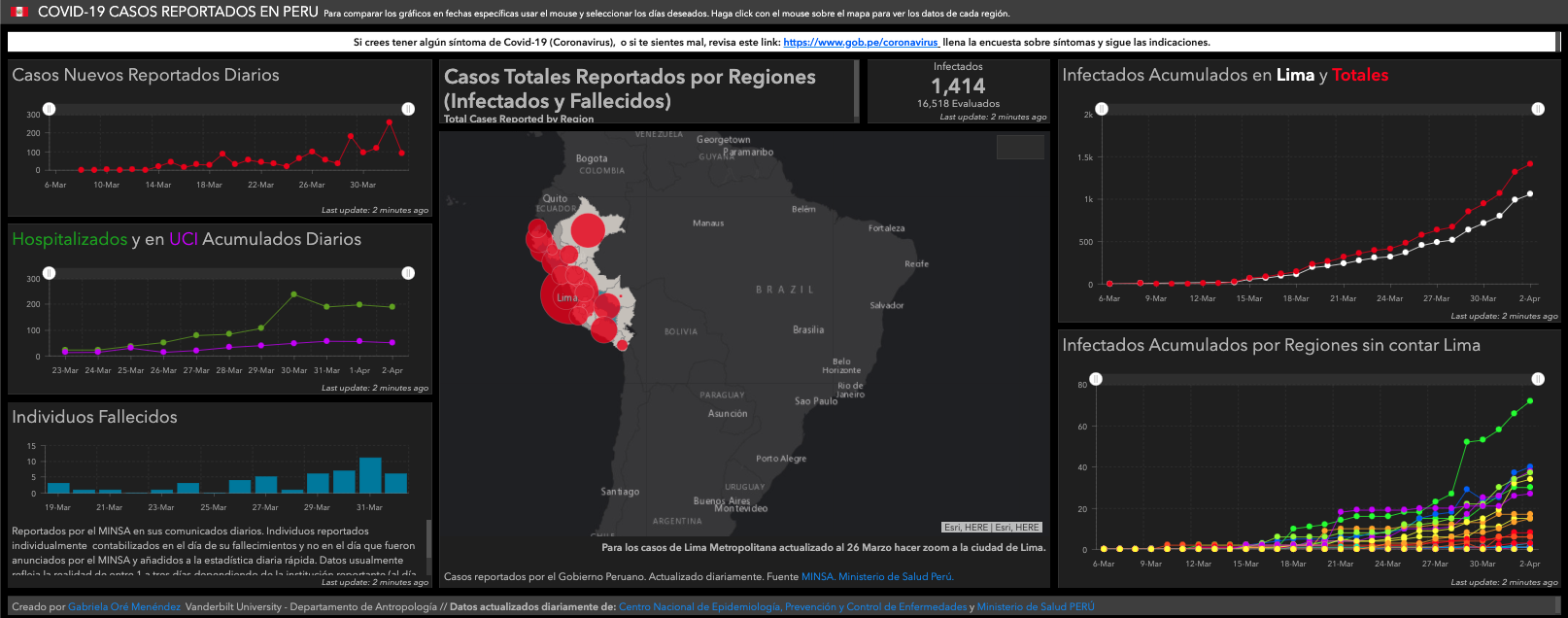
Inspired by Robbins’ efforts, anthropology Ph.D. student Gabriela Oré—who normally spends her days as an archaeologist studying the Andes—decided to build a similar map for her native Peru. The Peru COVID-19 map provides the latest information from Peru’s Ministry of Health, which is updated daily. It includes not only diagnostic data but also displays the severity of the disease in hospitalized patients, showing the rising demand for ventilator support. There is also a chart that shows the rate of new diagnoses over time—making it possible to track the impact not only of the disease but of mitigation factors, like the implementation of social distancing orders.
“It can be difficult to comprehend the impact of something like this from a news report or a press conference,” she said. “A map like this can help the public easily understand how this crisis is affecting their area.”
Both maps have been widely shared on social media and the Tennessee map has been used as a reference by Metro Nashville’s coronavirus task force. Both maps are available for any public health agency or task force to use.
Wernke says he’s thrilled by how readily Robbins and Oré pivoted from their fields to public health. “We’re seeing a real groundswell of efforts by scholars here at Vanderbilt and elsewhere to deploy our expertise in new ways to help address this emergency,” he said. “These maps are a great example of how we are leveraging SARL and how the SARL lab group is using their transferable skills to inform the public and policymakers during this crisis.”