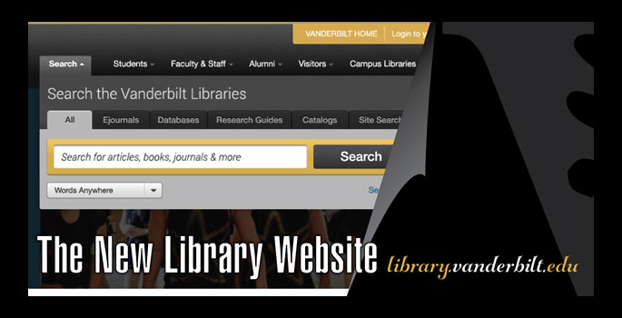
The Jean and Alexander Heard Library at Vanderbilt University has launched its new website. The redesign takes into account library user feedback while capturing advances in Web design to create a robust user-centered experience.
This two-year project is the culmination of a huge collective effort, involving staff from across the Heard Library and University Web Communications. Website users can look forward to significant improvements.
“User feedback showed that our Web pages were rated low compared to other library services,” said Connie Vinita Dowell, dean of libraries. “Our new design takes into consideration our wide variety of users, who have different priorities and familiarity with research.”
Dowell noted that all users can continue to connect with Acorn, the “Ask Us” feature and the research guides via the website.
Highlights include:
- All-Search feature combines all library resources into one set of search results – print and electronic resources along with contact information to a subject specialist in one of our campus libraries.
- Responsive design that provides an optimal viewing experience across a wide array of devices, whether you’re using a laptop, tablet or mobile device.
- Campus libraries are unified with a common look and common core content with consistent navigation to electronic resources as you move from library page to library page.
“The library website has a great new look and the interface and search will be particularly useful for our students,” said Catherine A. Molineux, associate professor of history. “After getting oriented to the new layout, I am once again using all my favorite tools and preferred databases.”
Pages have been redesigned for the main Heard site as well as campus library pages for Central, Divinity, Management, Law, Music, Peabody, Science and Engineering, and Special Collections. Efforts were also made to align better the library’s Web presence with the Vanderbilt Web presence.
An interactive tool provides more information on the redesign. In addition, comments and constructive feedback about the redesign are encouraged.
“I just saw the website! I’m honestly floored – it looks fantastic,” said Keith Neely, a recent graduate from Vanderbilt’s College of Arts and Science. “Very easy to navigate, and I like how it borrows stylistically from the main Vanderbilt Web page. All in all, I’m very impressed with the way the website has come together.”
The site is now powered by the OmniUpdate content management system managed by University Web Communications.
Hilary Craiglow, director of the Walker Management Library, contributed to this story.
