Explore the Brand Style Guide
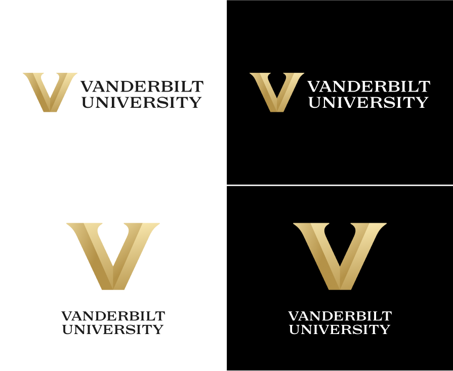
Primary Lockups
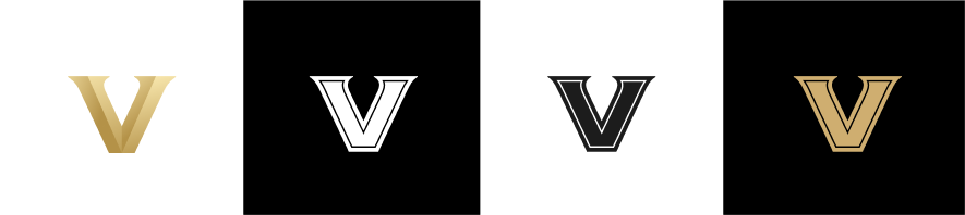
Our custom-drawn logotype is inspired by classic engraved lettering styles and modern interpretations. It possesses a wide stance and an even rhythm, giving it a feeling of stature. As we use the new logotype and associated lockups, Vanderbilt will portray the perfect blend of classicism and modernism. The dimensional metallic V ensures prominence of our most iconic asset.
If a V-forward lockup is desired, or you are designing a centered layout, or you need a more vertical vs. horizontal logo footprint, you may choose to employ the centered lockup.
Marks and logos are for authorized use only.
Please note for all downloads, PNGs are provided in RGB for screen use, and EPSs are provided in CMYK for print use. If you are printing a high-end or large-quantity piece with a professional printer, you should use a version of the marks that specifies metallic inks (PMS 871) or foils. Contact brand communications to receive files configured to use PMS 871 metallic.
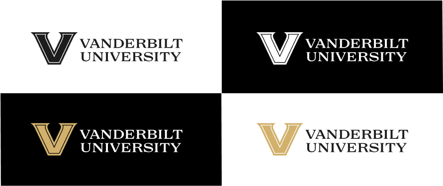
Special-Use Case: Pinstripe V Lockups
In situations where printing the gradient of the beveled V within the primary lockup isn't possible (for example, on merchandise and certain signage), or when a small-scale use of the primary lockup doesn't render well, the preferred alternate is the pinstripe V lockup. The pinstripe adds a distinguishing detail, providing an effective alternative when the full gradient cannot be used.
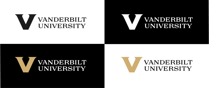
Special-Use Case: V Lockups
This special-use V lockup is built for the rare instance when a particular printing process is unable to reproduce the primary mark or the pinstripe V effectively (for example, embroidery or another print process that doesn’t allow for fine detail). Contact brand communications if you need this version.
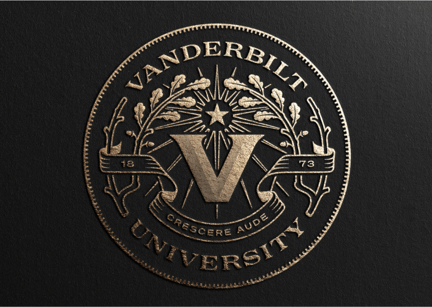
Seal
As an extension of our new identity, we have updated and modernized our drawing of the classic Vanderbilt seal. Our custom-illustrated seal features our new motto (Crescere aude, "dare to grow"), year of founding, and reference to symbolism important to Vanderbilt’s distinguished history. Oak laurel branches are showcased here as a symbol of strength. The north star guides our way, and the circular container shape alludes to the markings on a compass.
For official use only. Contact brand communications if you would like to use the seal asset.
Logotype
Our custom-drawn logotype is our primary wordmark. When used by itself, it can brand less formal communications.


V Icons
Our V icon provides a clear way to tie your communications piece to the Vanderbilt brand when you have limited space, or an otherwise dense layout. Often, a V icon can be tucked into a corner to provide a subtle nod to the Vanderbilt brand.
- The dimensional V is the primary mark and should be used most often. It is used for academic school and department lockups, and to abbreviate the primary Vanderbilt lockups.
- The pinstripe V is reserved for small-scale applications only and in situations when you are unable to use the dimensional V version.
School Lockups
Our brand needs to extend across the many areas of our community, from schools to departments to programs. Our brand architecture is designed to be flexible and clear, associating sub-brands with our larger master brand and displaying clear hierarchy. Primary school lockups can be downloaded below; department-level lockups will be released on a phased basis beginning summer 2022. Departments needing to use their department-level logo should continue to use their existing logos.


Clear Space
All lockups can use the height of their respective icons to determine clear space required for the mark around all sides. This could be either the height of the V or height of the seal.
Minimum Scale
Please use the guidelines below when scaling down our lockups and icons. Keep in mind that if an asset is used very small, the least detailed version available to you is recommended.
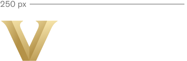


- Minimum width for our primary horizontal lockups with icon is 250 px, or 2 inches in print. If a lockup needs to be used below that size, we recommend the pinstripe V lockup, which can be used at 200 px or 1.5 inches and above. Below that, default to logotype only, which has a minimum width of 150 px or 1 inch in print.
- If there is only room for the V icon, the minimum width for the dimensional V or pinstripe V icon is 75 px or .5 inches in print. In special contexts below this size (like a favicon), only the plain V should be used.
Style Guide
PDF versions of the university and athletics guidelines are available for download.
Sesquicentennial Style Guide
A .pdf version of the V150 style guide, including links to download logos, is also available. A suite of digital assets, including PowerPoint templates, Zoom backgrounds, and more is also available below.
Dare to Grow Style Guide
A .pdf version of the Dare to Grow style guide, including links to download logos, is also available.